Wayzi Navigate: find your place, then move through the page.
A long page has a structure, but it is not always easy to see or move through. I designed and built Wayzi Navigate to make its landmarks and headings available in a searchable panel. The working component brings together keyboard navigation and personal preferences for how that panel looks and behaves. Development and accessibility validation are ongoing.
01Working prototype

The working demo filters the page's heading list as someone searches. The panel also surfaces a contrast warning for the current demo colours. 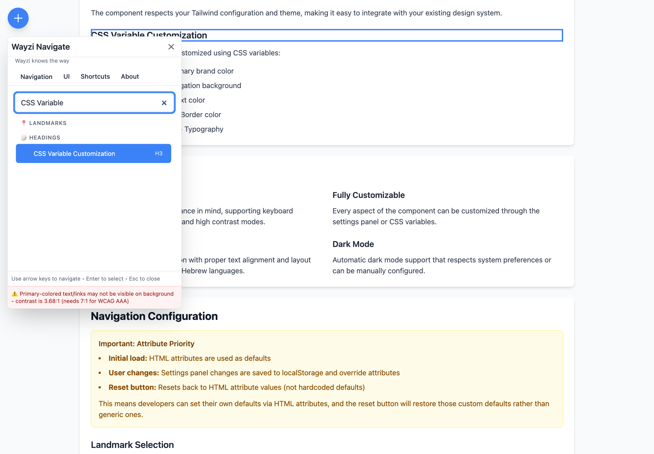
Select a heading to move to its place in the document. Auto-close is switched off here, keeping the selected result and the highlighted destination visible together. 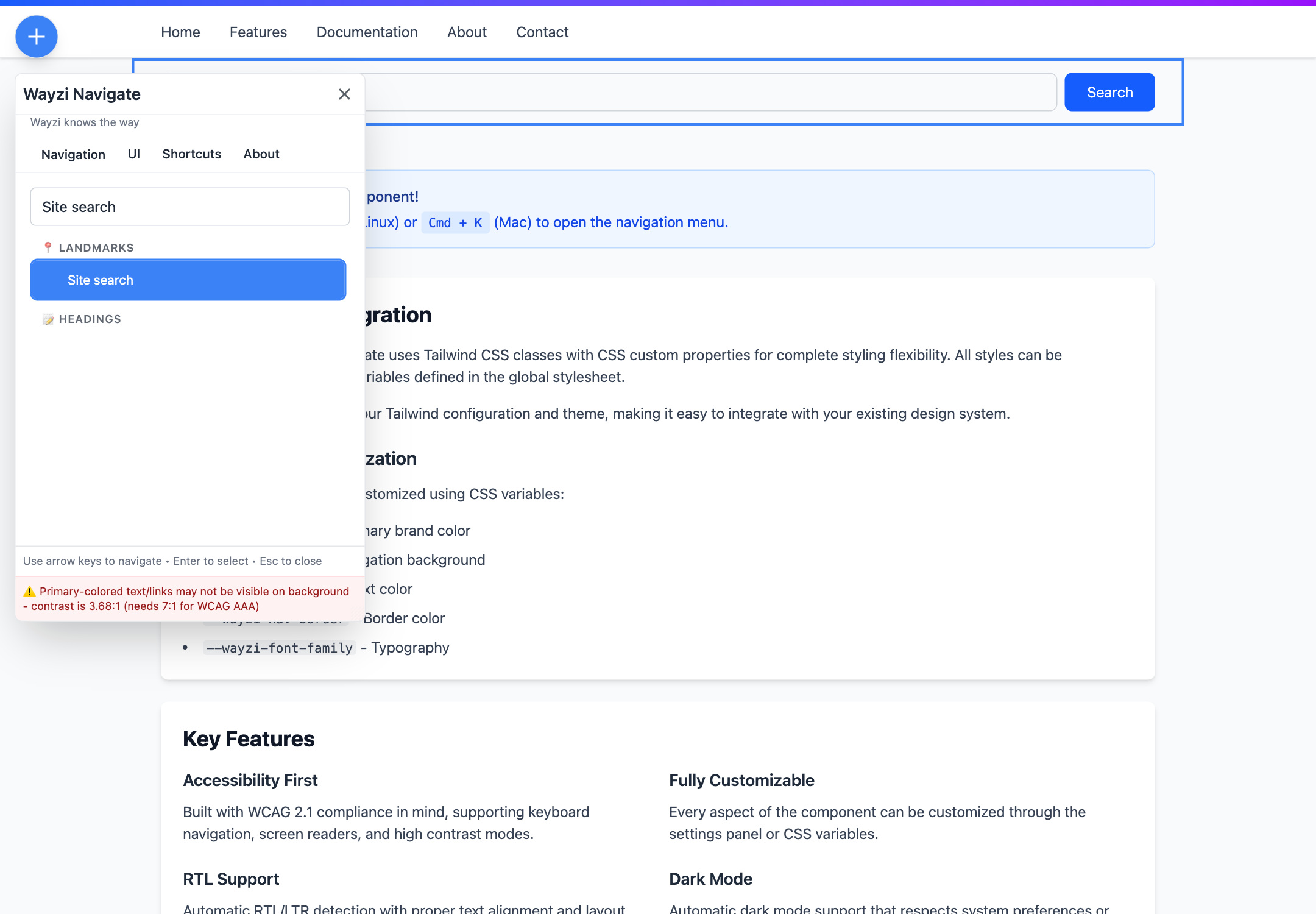
Landmarks provide a different route through the page. Selecting Site search brings the search region into view, without stepping through every heading. 
Shortcuts can be reassigned for repeated navigation. The settings also explain how to record a combination, cancel and move between fields. 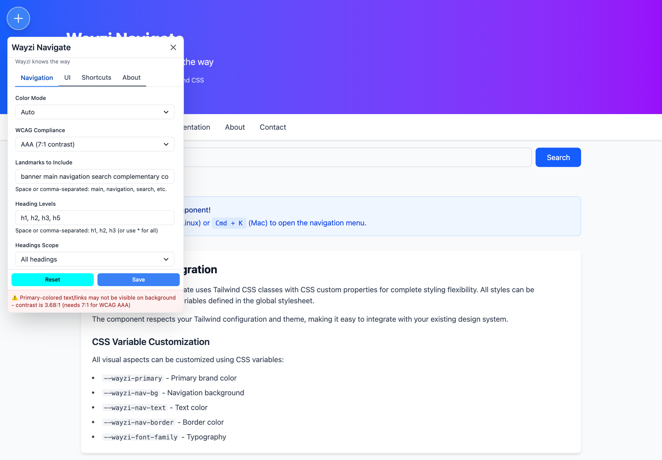
Preferences let someone choose what the panel includes. The contrast target controls warnings; it is not a certification of the page's accessibility.


- Role
- Design, architecture and engineering
- Stack
- Web Components
- TypeScript
- CSS custom properties
- Tailwind CSS
- Status
- Working prototype, in development
- Structure Navigate the page through its landmarks and headings.
- Control Search, select and close the panel with the keyboard.
- Preferences Adjust the component's presentation and shortcuts.
02The question
How can the structure of a page become a useful control?
A header, a search region, the main content and a list of headings describe different ways into the same page. Someone looking for a section may want to search its name. Someone moving repeatedly through a long page may prefer a keyboard shortcut.
Wayzi Navigate brings those routes into one component. It reads the host page's landmarks and headings, groups them, and lets someone choose where to go. The host document remains the source of that structure.
I took this from interaction design into a working TypeScript implementation. The current work centres on the Navigate component. Other ideas in the broader Wayzi project are at different stages and are not required for this component to work.
04Personalisation
Let people adjust the tool they are using.
The preferences panel covers colour mode, colours, type size, density, position and navigation behaviour. Keyboard shortcuts have their own settings. Preferences are stored locally so they can be restored on a later visit in the same browser.
Font and density controls are scoped to the component. That distinction matters: changing the navigation panel should not unexpectedly resize the document someone is trying to use.
wayzi-navigate {
--spacing: calc(0.25rem * var(--wayzi-density, 1));
--text-base: calc(1rem * var(--wayzi-font-scale, 1));
}
This excerpt from the stylesheet connects user preferences to CSS variables. The component then uses those values in its own controls. It is a practical connection between a design decision and the implementation that has to respect it.
05Screen readers
Make a change of location understandable without seeing it.
For someone using a screen reader such as VoiceOver, an outline around a heading cannot carry the whole interaction. The destination needs a meaningful name, and a change of location needs to be communicated through more than its position on screen.
Wayzi gives navigation items accessible labels that identify their landmark or heading level. A persistent, visually hidden live region receives updates when the menu opens, a result is selected or settings are saved. It is marked as a status region with polite announcements, giving assistive technology an update to present alongside the page's own semantics.
<div
role="status"
aria-live="polite"
aria-atomic="true"
aria-relevant="additions text"
>
Navigated to Heading level 3: CSS Variable Customization
</div>
This shows the region's attributes and the message captured from the working demo. Its visual-hiding styles are omitted for readability. Selecting the search region produced “Navigated to Landmark: Site search”. These are updates emitted by the component, rather than a transcript of VoiceOver speech.
The captures use the option to keep the panel open after navigation. That makes the selected item and destination visible together. It also provides a useful scenario for testing the relationship between focus, visual highlighting and announcements.
The next VoiceOver review needs to check what is actually heard, when it is heard and where keyboard focus continues. Announcement timing when the panel closes, focus after choosing a destination and shortcut conflicts are part of that review. A live-region message alone cannot establish that the complete journey works well with a screen reader.
06Design considerations
Direction and contrast belong in the behaviour.
The source includes document-direction detection, language handling and translated interface strings, including Arabic. The intention is to account for reading direction in the component rather than treating it as a cosmetic change added at the end.
That implementation still needs review with native speakers and assistive technology. Direction detection and translated labels are useful foundations; they do not establish that every interaction works equally well in every language.
Colour customisation introduces another responsibility. The component calculates contrast and surfaces warnings against a chosen target. The demo captures show one of those warnings. Making it visible helps someone understand a consequence of the colour configuration, but the check does not assess the whole page or all accessibility requirements.
07Current state
Working behaviour, with validation still to do.
Wayzi Navigate has a working component, a demo, configurable navigation and saved preferences. It provides concrete material for evaluating the interaction instead of relying only on static screens.
The next step is to test that interaction with people using different navigation methods, then resolve the issues those sessions expose. Focus behaviour, shortcut conflicts, language quality and the amount of control offered by the settings all need that scrutiny.
The project remains in development. The contribution here is the designed and implemented interaction, together with a clear boundary around what has and has not been validated.